Introduction
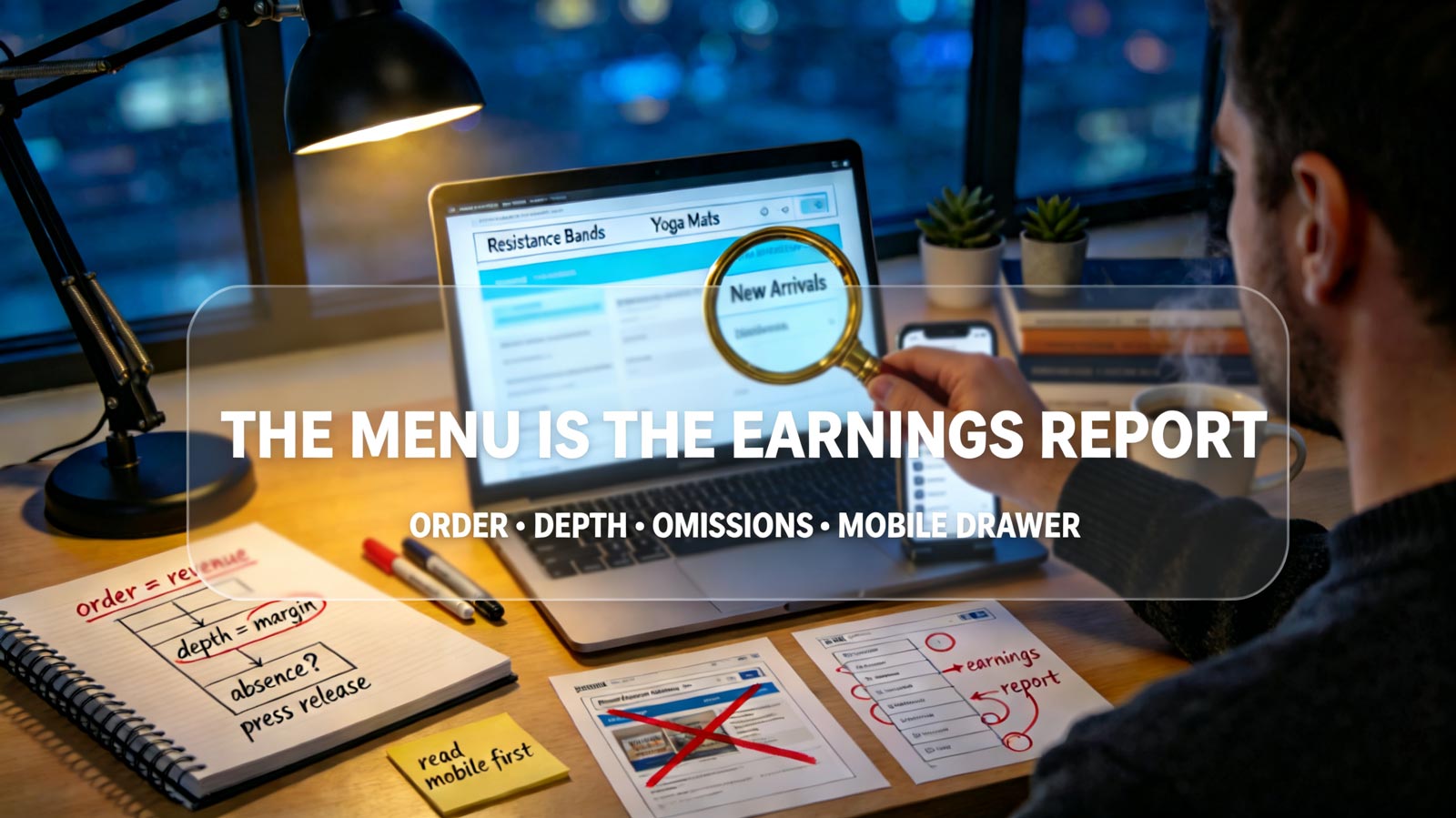
Every homepage is a press release. It shows you the launch the store is proud of, the category it wishes were the business, the hero product marketing wrote the story around. The navigation bar has no such vanity. It is built by clicks, reorganized by revenue, and trimmed by whatever the data says customers actually came to buy. A store can write anything on its homepage — but it can only afford to put one thing first in the menu. This guide breaks down why the navigation bar is the most honest document on any store, the four signals it leaks, and how to read any competitor's real money-maker in under five minutes.
Why the Menu Can't Lie
Three forces keep navigation brutally truthful while every other page stays aspirational:
-
Click data rewrites it. Menu positions are the most expensive real estate on the site, and stores A/B test them relentlessly. The category sitting in position one earned that spot through traffic and revenue, not through a branding workshop. What survives in the top slots is what pays for them.
-
Attention is rationed. Desktop menus hold five to seven items before usability collapses; mobile drawers hold even fewer. Every category that made the cut displaced one that didn't. The menu is a forced-ranking exercise the homepage never has to face.
-
It has to work on every visit. Homepage visitors skew toward first-timers, but menu users are mostly returning buyers — the people whose behavior the store has studied most closely. The menu is designed for its most informed audience: its own repeat customers.
The homepage tells you what a store wants to be. The menu tells you what it is.
What the Menu Actually Reveals
Read past the labels and the menu opens up like a ledger:
-
Order is revenue rank. The first two positions drive the overwhelming share of menu clicks, and no rational store spends them on anything but its proven earners. Position one is the money-maker; position two is the runner-up. Everything after is supporting cast.
-
Dropdown depth is margin confidence. A category that expands into subcategories, featured tiles, and curated collections has the traffic to justify that design work. A category that gets a single bare link is being maintained, not grown.
-
Absence is the loudest signal. Whatever a store sells but refuses to menu is worth hunting for. Often it's a low-margin traffic category the store depends on but doesn't want compared, or a legacy line kept alive for SEO. The gap between what the homepage features and what the menu omits is a map of strategic embarrassment.
-
Mobile forces confession. Desktop menus can hide hedges in hover states. Mobile drawers can't — everything competes for the same short list. Reading the mobile menu alone often gives you the cleanest version of the truth.
Two stores can sell identical catalogs and be completely different businesses — and the difference is spelled out in six menu links.
What Menu Reading Looks Like in Practice
A realistic scenario based on typical patterns: a seller entering the home-fitness niche opens a leading competitor's store. The homepage hero banner is pushing a premium smart-jump-rope launch — branded imagery, founder quote, waitlist button. The seller almost writes the competitor off as a premium-player. Then they open the menu.
Position one: resistance bands. Position two: yoga mats. The smart rope sits third, inside a "New" dropdown with no subcategories. The seller checks a store intelligence tool like ShopFindBiz and confirms the pattern: the competitor's traffic and sales concentrate in sub-$40 accessories, while the premium launch is a margin experiment at best. The homepage was a press release; the menu was the earnings report. The seller repositions their own entry — competing in the band category the market has already proven, not the premium tier the competitor was merely auditioning. Six menu links just redirected an entire market-entry strategy.
The Reading Discipline
Menu reading rewards structure and punishes skimming. Four rules keep it accurate:
-
Read mobile first. The mobile drawer is the forced confession. Screenshot it before opening the desktop site — once you've seen the hover menus, you'll read generosity into structure that mobile doesn't have.
-
Map depth, not just labels. For each menu item, note whether it drops down, expands, or dead-ends. Depth is a capital-allocation statement: design hours follow expected revenue.
-
Inventory the omissions. List what the store sells that never touches the menu. Then ask why — usually the answer is either embarrassment (thin margins, weak reviews) or protection (a cash cow it doesn't want challenged).
-
Verify against real sales data. Menus tell you what a store believes; sales data tells you what's true. Use a store intelligence tool like ShopFindBiz to cross-check the menu's claims against actual traffic and revenue concentration before betting your own inventory on the read.
Reading a Menu in Five Minutes
Run the scan before your next product meeting. Open any competitor's store and look for three patterns:
-
The menu contradicts the homepage. The widest-open opportunity: the store is publicly committed to a category its own navigation won't prioritize. Its real money-maker is under-defended.
-
One category hogs the depth. A single menu branch carrying all the featured tiles and subcategories marks the store's profit engine — and its single point of failure. Compete there, or flank it.
-
Everything is equally weighted. The rarest and most telling pattern: a store with no priorities. It's either drowning in catalog or has never studied its own data. Both are invitations.
Conclusion
Stores will tell you anything on their homepages — launches, missions, visions. But the navigation bar is where the bills get paid, and it can't afford the fiction. Order ranks revenue, depth marks confidence, and absence confesses what the homepage is too proud to show. The sellers who learn to read the menu stop competing with the store a competitor advertises and start competing with the store it actually operates. In a market where everyone polishes their front window, the winners are the ones reading the ledger by the door.