Introduction
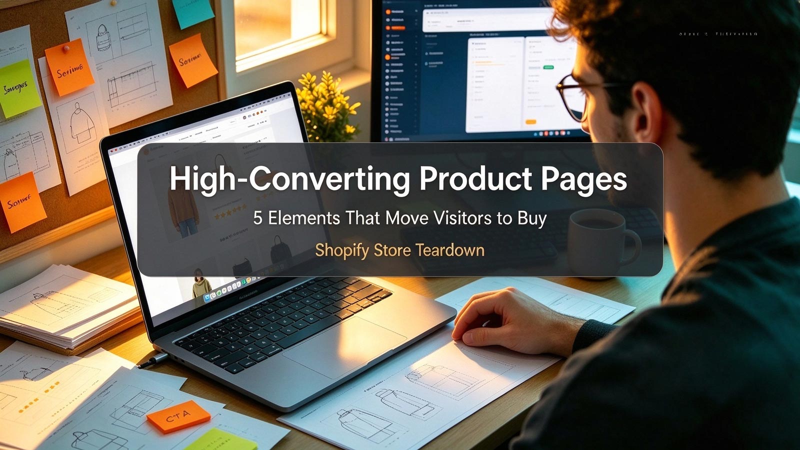
In e-commerce, your product page has one job: turn a visitor into a buyer. Everything else—ads, social media, SEO—simply delivers traffic to this single moment of decision.
But what separates a store converting at 0.8% from one converting at 3% or higher? We went through 100+ top-performing Shopify stores across beauty, fashion, home goods, and food & beverage to find out. The answer was surprisingly consistent: nearly every high-converting product page gets the same five elements right.
This teardown breaks down each element, shows how leading stores implement it, and gives you concrete changes you can make this week—whether you're launching your first product or optimizing your fiftieth.
High-Quality Product Images and Videos
Online shoppers can't touch, feel, or try your product. Your visuals carry the entire sensory experience, and high-converting stores treat them accordingly.
Across the stores we analyzed, a clear pattern emerged: they lead with lifestyle images that sell the outcome, not just the object. A flat white-background shot might come second or third in the gallery—but the hero image shows the product in real use, helping visitors immediately picture it in their own lives.
Beyond the hero shot, top stores consistently include:
- Multiple angles with zoom functionality—front, back, side, detail close-ups, and a scale reference. Zoom is non-negotiable; customers want to inspect texture and quality before committing.
- Short product videos or GIFs instead of static images alone. A 15–30 second clip demonstrating features, fit, or usage removes uncertainty fast. Apparel stores show movement and fit; gadget stores show the product in action.
- Visual consistency. Same lighting, same background style, same mood across every image—so the page feels like a brand, not a catalog dump.
These visuals do double duty: they boost conversions and reduce return rates by setting accurate expectations before purchase.
Compelling, Scannable Product Descriptions
High-converting stores don't list features. They sell benefits—and back them up with specs.
The pattern we found: benefit-first framing. Instead of "water-resistant fabric," the description reads "keeps your laptop dry through an unexpected downpour—no more commuter panic." The feature becomes the proof; the benefit becomes the headline.
Top stores also keep descriptions skimmable. No walls of text—bullet points, bolded keywords, and short subheadings let a visitor absorb the key points in ten seconds. Practical details like sizing charts, materials, care instructions, and dimensions are included directly on the page, because ambiguity kills conversions.
Finally, the copy sounds like the brand. Whether playful, professional, or minimalist, the tone matches the rest of the site, creating a cohesive experience that builds familiarity.
A useful test: read only your bullet points. If they don't convince a first-time visitor on their own, rewrite them.
Social Proof Placed Where Decisions Happen
Nearly every store in our analysis displayed reviews. The high-converting ones displayed them earlier—and more strategically.
The difference is placement. Top stores put star ratings near the product title, visible without scrolling. This single pattern appeared more than almost any other across our analysis.
They also integrate photo and video reviews directly into the product gallery. Seeing a real customer's unboxing or try-on beats ten paragraphs of marketing copy. The best stores go further, weaving user-generated content into the page itself—Instagram-style customer photos that turn past buyers into the sales team.
And the most effective reviews answer objections before they're asked. High-converting stores prompt reviewers with questions like "What did you love?" and "Who is this perfect for?"—so new visitors see their own doubts resolved by real people.
Collecting these reviews is its own system: post-purchase follow-up emails, small incentives, and loyalty perks. The stores winning here treat review generation as a core marketing function, not an afterthought.
Trust Signals That Remove the "What If"
Here's the element most stores underinvest in: explicit reassurance at the exact moment of hesitation.
High-converting product pages stack multiple trust signals close to the buy button:
- A clear return and refund policy, stated in one or two sentences right on the product page—not buried in a footer link.
- Money-back guarantees where applicable, with the badge placed near the CTA so it's seen at the decision point.
- Secure checkout badges (SSL, payment icons) visible in the cart area, not just the site footer.
- Shipping expectations stated upfront. Delivery timeframes, free-shipping thresholds, and dispatch information eliminate the number-one source of checkout abandonment: uncertainty.
For newer or lesser-known brands, this element matters even more—you're asking strangers to trust you with their card details. A single well-placed guarantee line can recover sales you'd otherwise lose silently.
A Clear, Frictionless Call-to-Action
The final element is deceptively simple: make buying effortless.
Top stores use high-contrast CTA buttons with clear text, sized generously—especially on mobile, where most Shopify traffic actually converts or doesn't. Speaking of mobile, the biggest pattern we observed is the sticky add-to-cart bar: as shoppers scroll through images and reviews, the buy button stays within thumb's reach. It has become standard among leading stores, yet most small stores still don't have it.
For hesitant visitors, high-converting pages offer secondary CTAs—"Add to Wishlist," "Notify Me When Back in Stock," "Save for Later"—capturing interest that isn't ready to buy today without distracting those who are.
And around the primary CTA, they keep things clean. No pop-ups, no banners, no competing product recommendations fighting for the same click. Small details compound here: leading stores A/B test button copy, color, and placement constantly, because even a 0.2% lift at this stage translates directly into revenue.
Conclusion
High-converting Shopify product pages aren't built on tricks or secret hacks. The 100+ stores we analyzed win on the same five fundamentals: visuals that sell the experience, descriptions that lead with benefits, social proof placed early, trust signals that remove hesitation, and a CTA with zero friction.
None of this requires a full redesign. Pick your weakest element, fix it this week, measure the result, then move to the next one. Compounding five small lifts is how 1% stores become 3% stores.
And if you want to see how the stores ahead of you are doing it—study them directly. With ShopFindBiz, you can analyze competitor Shopify stores, track their product pages, and turn their best tactics into your roadmap. Start your teardown with the stores already winning in your niche.