Introduction
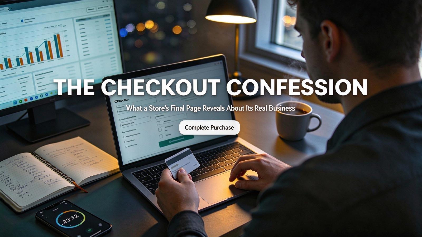
Most sellers analyze competitors by staring at product pages and ad libraries. Almost none of them think to open the checkout. That's a mistake—because the checkout page is the most honest page on any store. Product pages are marketing; the final page is confession. This article shows you how to read a competitor's checkout the way a store analyst does: not as a customer, but as a decoder. From shipping fees to trust badges, every element reveals the store's real margins, traffic quality, and revenue strategy. Here's what to look for.
The Psychology of Checkout Design
The checkout is a psychological battleground—and its design reveals the business behind it. A two-step, one-click flow signals a store that trusts its traffic; a high-friction checkout with forced account creation belongs to a store paying too much for visitors and desperate to capture emails.
The same logic applies to urgency. Aggressive countdown timers mean impulse traffic—paid social, influencer drops. A calm, quiet checkout usually means search or brand traffic that's already decided.
Trust signals complete the picture. Heavy security badges and payment logos mean cold, first-time buyers. None at all? You're looking at a repeat-purchase store that doesn't need to reassure anyone.
So what can you actually decode at a glance? Three things:
-
Friction Level: Fewer steps signal high traffic quality and a conversion-confident operation.
-
Urgency Intensity: Aggressive scarcity copy is a proxy for impulse-driven traffic and inventory pressure.
-
Trust Investment: Heavy trust signaling means the store lives on cold traffic—an expensive, acquisition-heavy model.
Hidden Fees and Revenue Strategies
Now for what the checkout confesses about money. The most revealing question in any store analysis is simple: when do the fees appear? Stores that disclose full costs upfront have made a strategic bet on transparency and retention. Stores that surface shipping or handling charges only at the final step are running drip pricing—and according to Baymard Institute research, unexpected costs are the single biggest driver of cart abandonment. If a competitor can afford that abandonment rate, their margins are healthier than they look, or their traffic is cheap enough to waste.
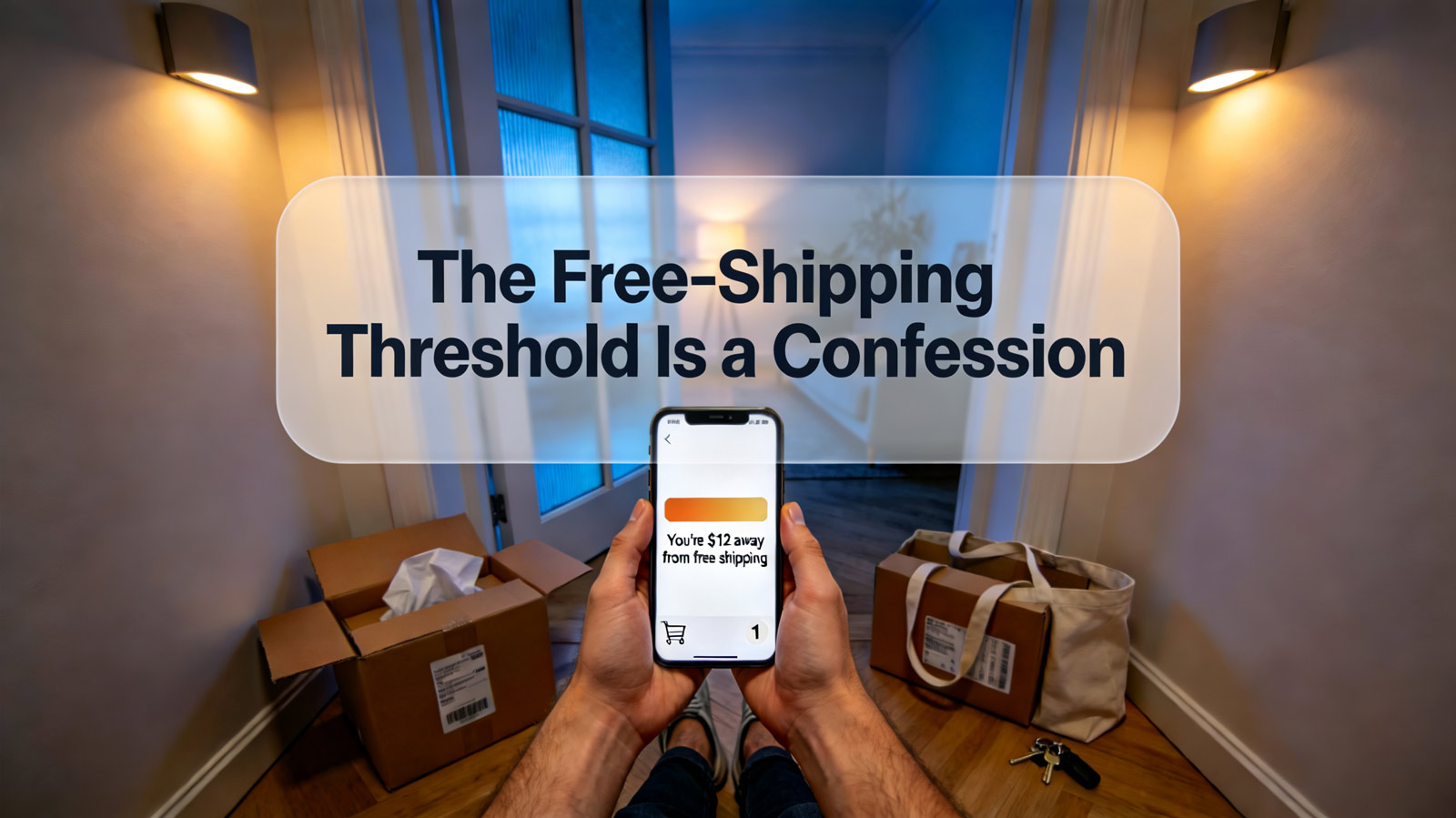
Here's where checkout analysis gets genuinely powerful: you can reverse-engineer margins. Cross-reference the store's free shipping threshold, its average product price, and its upsell offers, and the shape of its unit economics emerges. A store with a $75 free shipping threshold on $55 products, plus a "Frequently bought together" bundle at $25, isn't being generous—it's engineered the exact basket size needed to protect profitability. Apple's optional AppleCare+ add-on works the same way: a low-friction margin amplifier, not a convenience.
Payment options tell their own story. A competitor offering Klarna, Afterpay, or split payments is signaling a high average order value and confidence that buyers will complete repayment. A store accepting only PayPal is likely newer, or operating conservatively under payment processor risk controls.
And watch the revenue model hiding in plain sight:
-
Drip Pricing: Late-stage fees reveal either strong margins or desperate short-term revenue grabs—check which by testing the full flow yourself.
-
Upsell Architecture: The placement and relevance of add-ons shows how sophisticated the operator is; clumsy, generic upsells expose a dropshipping operation.
-
Subscription Push: Stores that lead with subscription benefits during checkout are betting on lifetime value over margin per order—meaning they'll outbid you on ad spend.
Customer Retention and Post-Purchase Engagement
Finally, the checkout reveals how a store plans to keep customers—or whether it plans to at all. A first-time-buyer discount in exchange for an email address is the classic signature of an acquisition-heavy store building a retention asset because paid traffic alone won't sustain it. If the competitor's checkout includes this, their ad costs are hurting, and their email list is their lifeline.
Loyalty program integration at checkout—Sephora's Beauty Insider is the canonical example—tells you the store has moved into the retention phase of its lifecycle. These are the hardest competitors to dislodge, because their profit comes from repeat buyers while you're still paying for first ones.
Personalization is the last confession. Saved addresses, one-tap "Buy Now" buttons, remembered payment methods: this is the infrastructure of a mature operation with a large returning customer base. If you see a bare, forgetful checkout, you're looking at a store that starts every transaction from zero—and that's a vulnerability you can exploit.
The retention signals to catalog in your store analysis:
-
Email Capture Trade: Discount-for-signup at checkout = acquisition pain and a mailing list you can out-communicate.
-
Loyalty Integration: Program prompts at payment = a retention machine; compete on differentiation, not discounts.
-
Personalization Depth: Saved preferences and accelerated repurchase flows = an entrenched competitor whose churn rate is low.
Conclusion
A competitor's checkout page is a microcosm of their entire business—their margins, their traffic quality, their retention strategy, all confessed in one place, with no marketing gloss. Stores that prioritize transparency, minimize friction, and invest in post-purchase engagement are built to last; stores with hidden fees and chaotic urgency are running on borrowed time. The next time you analyze a store, don't stop at the product page. Push through to the final page—it will tell you more in thirty seconds than an hour of ad spying. And if you want to run this analysis across dozens of stores without checking out a single cart yourself, ShopFindBiz's live competitor data does exactly that.